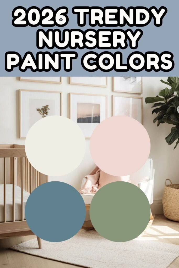
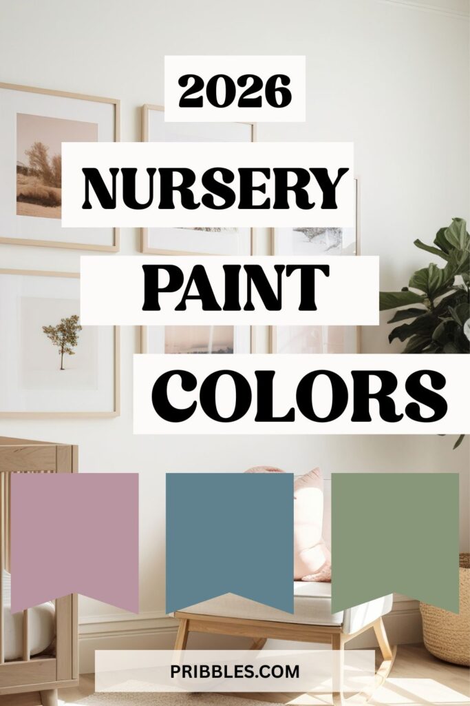
2026 Nursery Paint Color Trends You’ll Be Obsessed With
Designing a nursery is one of the sweetest parts of preparing for your baby. From picking the perfect crib to hanging those tiny clothes, every detail feels full of love — but the paint color?
That’s what truly sets the tone. The right shade can make your baby’s room feel calm and cozy, bright and cheerful, or timeless and elegant.
Save this to Pinterest!
Affiliate links may be used in this post and if so I will receive a commission at no extra cost. I’m also part of the Amazon Affiliate (Associate) program where I earn a commission from sales made through my affiliate links. Read the full disclosure policy.
This year’s nursery paint color trends are all about warmth, nature, and personality. Whether you’re drawn to soft sage greens, muted blushes, or creamy whites, these trending hues are here to create spaces that feel peaceful yet full of life.
Let’s explore the nursery paint color trends everyone’s obsessing over right now (and why you’ll love them too).
More to read:
- Girl Nursery Ideas Moms Are Obsessed With This Year
- Gender Neutral Baby Room Ideas That Are Calm, Cozy & Seriously Aesthetic
- Bright Beginnings: Cheerful Yellow Nursery Ideas for a Sweet Little Space
- How to Create a Green Baby Room: Style, Calm, and Sustainability in One Sweet Space
Why Paint Color Matters in a Nursery
The color you choose does more than make a room look pretty — it shapes how you and your baby feel in the space. Soft, muted tones can help soothe your little one (and your own tired mind during those late-night feedings), while warmer hues can make the nursery feel safe and grounded.
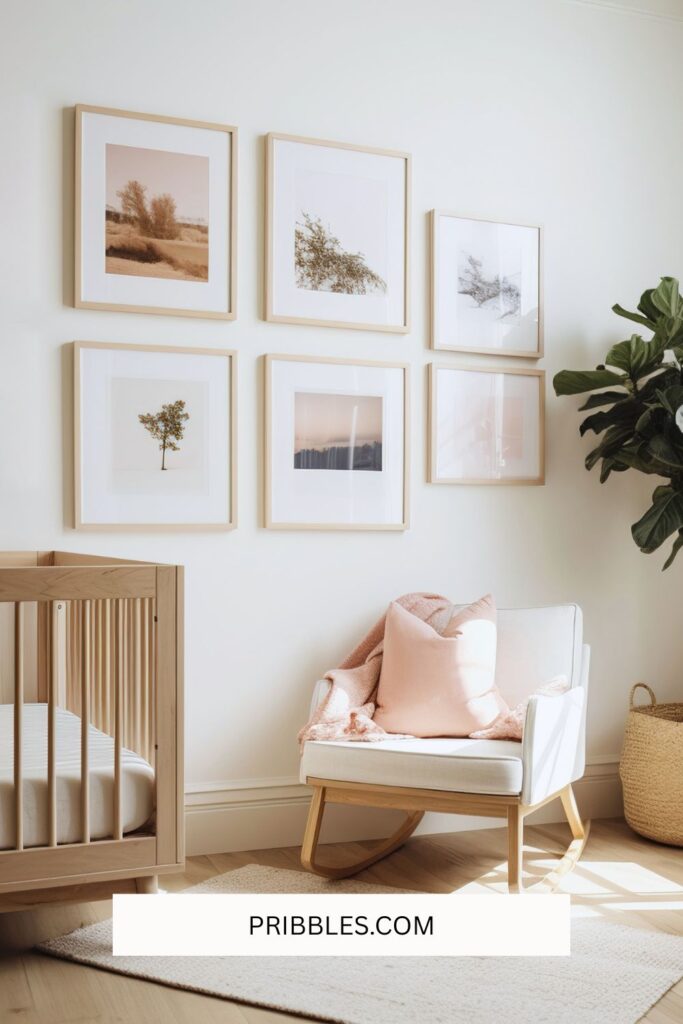
Paint also acts as a backdrop for your decor. The right tone can highlight your favorite wall art, cozy rug, or that beautiful wooden rocking chair you’ve been eyeing. Before you commit, grab a few samples and see how the color looks throughout the day — natural light and lamplight can change everything!
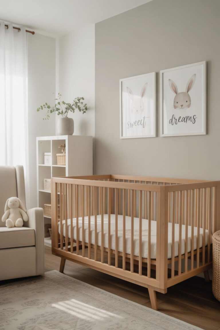
Trend #1: Earthy Neutrals
If calm, cozy, and timeless is your vibe, earthy neutrals will be your best friend. These shades — think soft beige, mushroom taupe, and warm greige — are soothing and sophisticated without feeling plain. They make the nursery feel like a gentle hug.
Earthy neutrals also pair perfectly with natural materials like rattan, oak, and linen. Add a woven pendant light, a chunky knit blanket, and a few leafy plants, and you’ve got yourself a serene little retreat.
Try these colors:
- Benjamin Moore “Natural Cream” — a warm, creamy neutral with a subtle beige undertone.
- Sherwin-Williams “Accessible Beige” — the perfect greige that works in any lighting.
- Behr “Mushroom Bisque” — cozy and grounding, ideal for gender-neutral spaces.
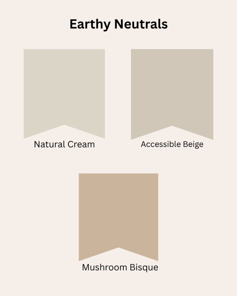
These tones are especially lovely if you plan to keep your nursery decor minimal or if you want a color that can grow with your child.
Trend #2: Soft Sage & Dusty Green
Sage green is officially the new neutral. It’s calming, fresh, and effortlessly elegant — the perfect balance between nature and sophistication. Sage brings a subtle touch of color without being overwhelming, which is exactly what makes it perfect for nurseries.
This color looks beautiful with light wood tones, creamy whites, or gold and brass accents. It also works across styles — from modern farmhouse to cottagecore to minimalist.
Try these colors:
- Farrow & Ball “Vert de Terre” — a soothing mid-sage that feels organic and balanced.
- Sherwin-Williams “Clary Sage” — warm, soft, and classic.
- Behr “Laurel Tree” — slightly deeper, perfect for creating depth on one feature wall.
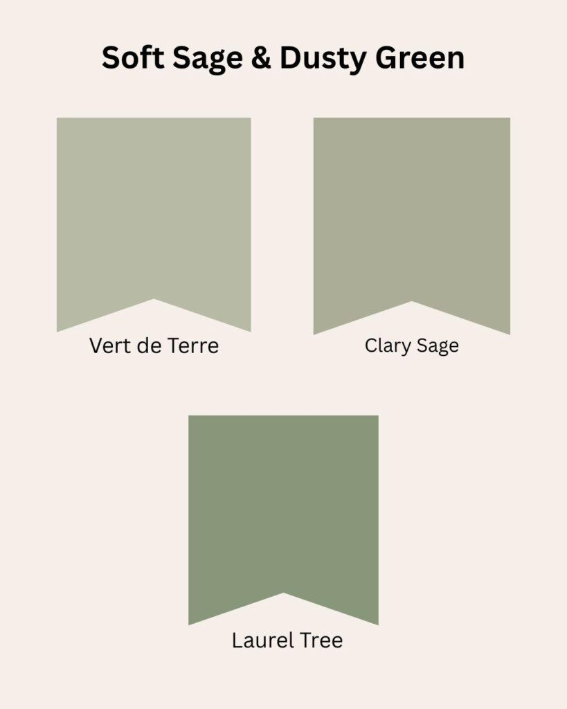
A sage nursery feels peaceful yet fresh — like bringing a little piece of the outdoors inside.
Trend #3: Warm Terracotta & Clay Tones
Warm terracotta, peachy clay, and soft apricot tones are stealing hearts this year — and for good reason. These earthy hues feel cozy and sun-kissed, bringing natural warmth into your baby’s space.
If you love boho or desert-inspired decor, this palette will be your dream come true. Pair these tones with woven textures, neutral textiles, and plenty of wood details for a space that feels grounded and full of personality.
Try these colors:
- Benjamin Moore “Terra Mauve” — a beautiful clay pink that’s both warm and soothing.
- Sherwin-Williams “Cavern Clay” — rich, earthy, and absolutely stunning for an accent wall.
- Behr “Sunwashed Brick” — a muted terracotta that glows softly in natural light.
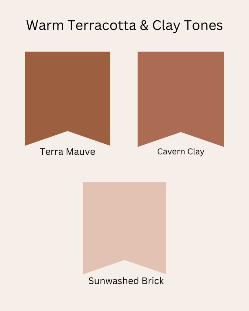
These colors photograph beautifully (hello, Pinterest!) and age gracefully as your baby grows.
Trend #4: Serene Blues
Blue has long been a nursery favorite — but this year, it’s taking a softer, more serene turn. Think misty sky blues, soft denim tones, and muted navy. These shades bring a sense of calm and help create a peaceful sleep environment for your little one.
Pair with crisp white trim, woven baskets, and light oak furniture for a coastal-meets-classic look. Or, if you’re feeling bold, go for a deep navy accent wall with warm beige or brass accents to balance it out.
Try these colors:
- Farrow & Ball “De Nimes” — a sophisticated slate blue that feels timeless.
- Sherwin-Williams “Misty” — airy, soft, and dreamy.
- Behr “Blueprint” — a mid-tone blue that’s calming but not too pale.
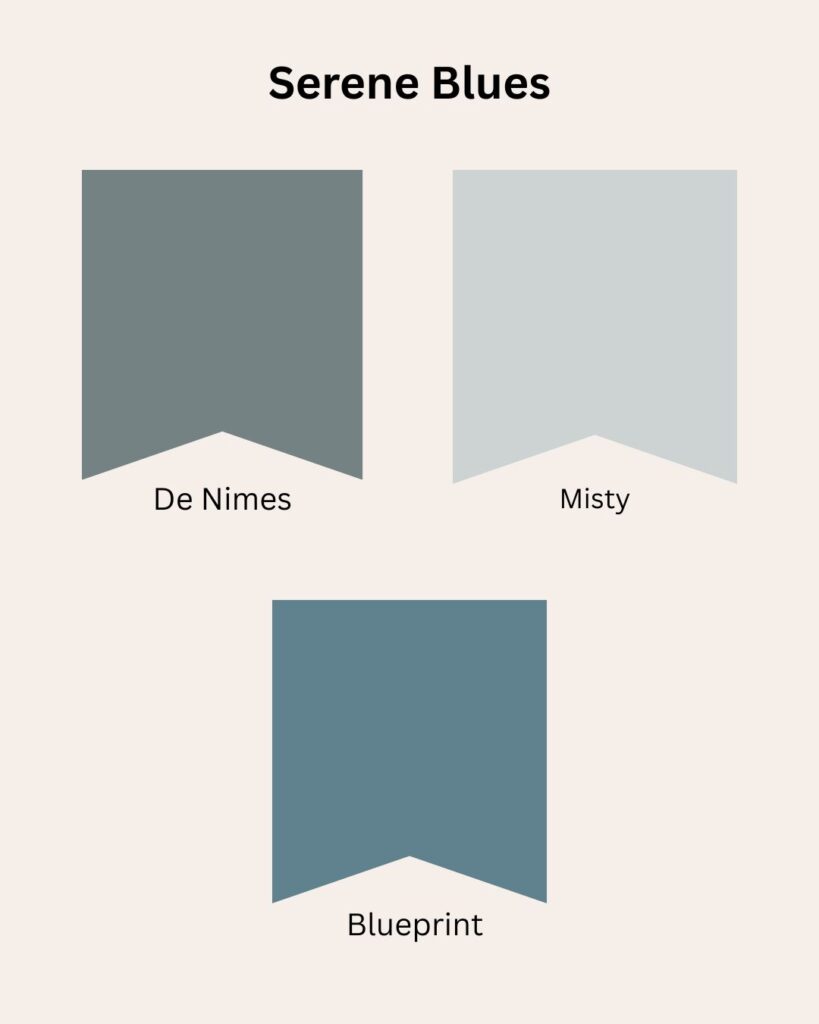
Blue works beautifully for both boys’ and girls’ nurseries — it’s all about the decor you pair it with.
Trend #5: Muted Blush & Dusty Rose
Blush is here to stay, but this year’s take is more muted, mature, and versatile. Instead of bubblegum pinks, we’re seeing soft rose, dusty mauve, and blush-beige tones that feel elevated and elegant.
These hues add a hint of sweetness without being overly feminine. They pair perfectly with whites, warm woods, and even greens or blues for a more modern palette.
Try these colors:
- Benjamin Moore “First Light” — a barely-there blush that glows in natural light.
- Sherwin-Williams “Rosé” — gentle, vintage-inspired, and warm.
- Behr “Delicate Blush” — a soft, muted pink that feels cozy and timeless.
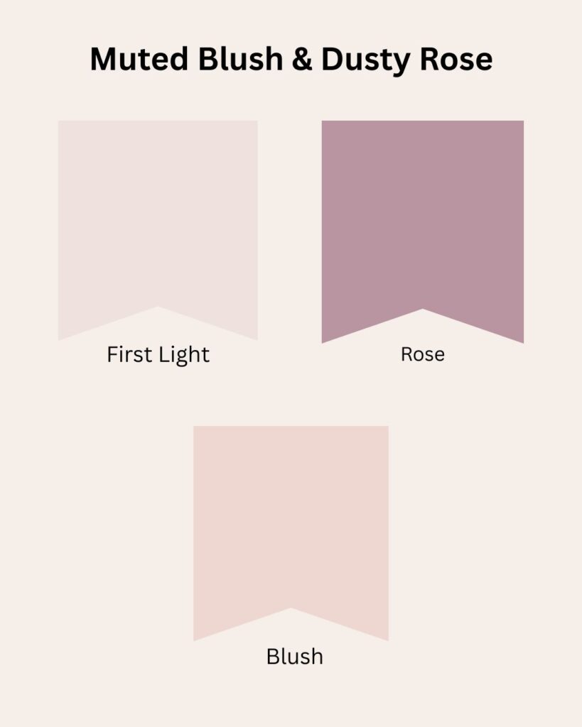
If you want a nursery that feels like a soft sunrise, dusty blush is a gorgeous way to go.
Trend #6: Cozy Creams & Off-Whites
White nurseries are timeless — but the modern twist is all about warm whites and cozy creams. Think ivory, oatmeal, and linen-inspired tones that add softness without being stark.
These shades create a light, airy base that works with any accent color or decor style. They’re perfect if you love a minimalist, Scandinavian, or cottage look.
Try these colors:
- Benjamin Moore “White Dove” — the ultimate warm white that flatters any room.
- Sherwin-Williams “Alabaster” — soft and creamy, never yellow.
- Behr “Swiss Coffee” — a cozy white with subtle depth.
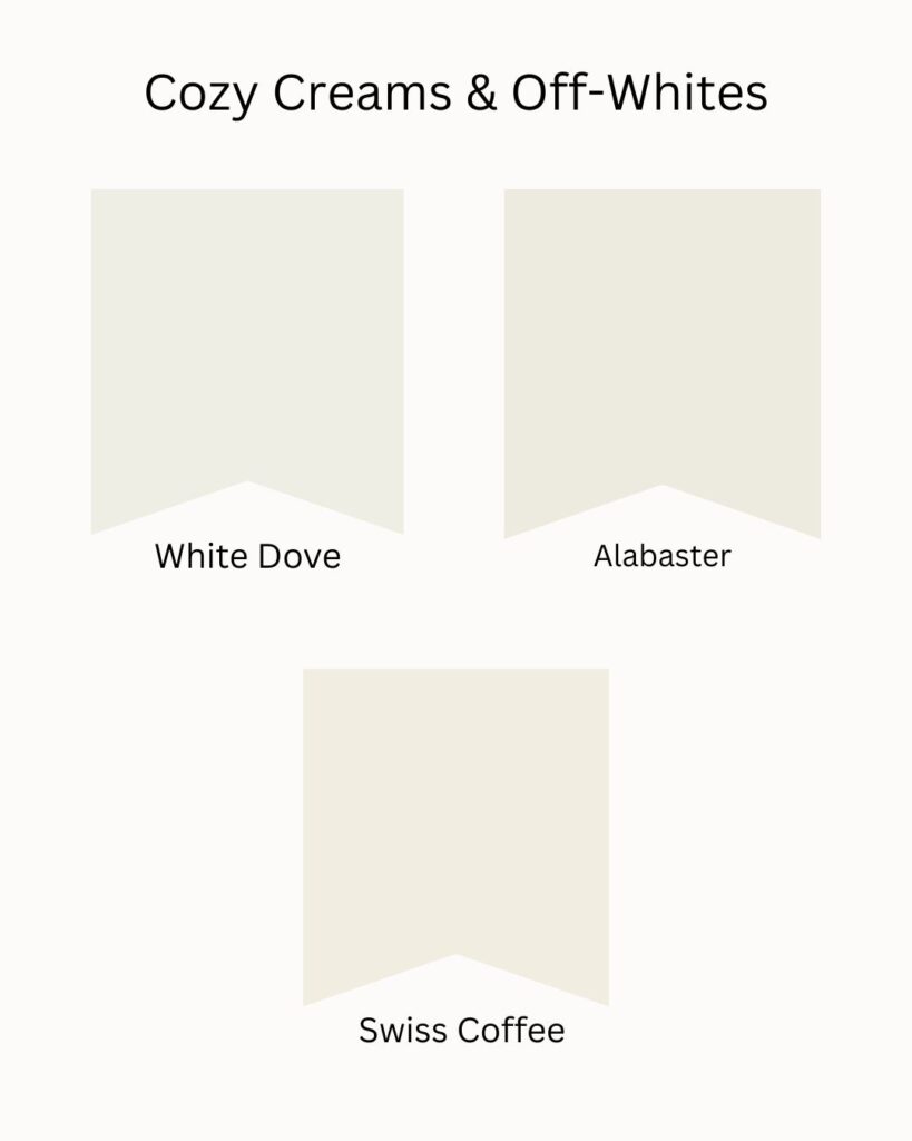
This trend is especially lovely for smaller nurseries — light colors help make the space feel bigger and brighter.
Trend #7: Moody Accents
For parents who love a little drama (the design kind, not the toddler kind 😉), moody accent colors are having a major moment. Deep olive greens, inky blues, and charcoal tones bring depth and coziness to a nursery without making it feel heavy.
Use them on one accent wall, behind a crib, or even on the trim and ceiling for a designer-inspired look. Pair these bold tones with soft textiles, warm lighting, and plenty of white to balance the mood.
Try these colors:
- Sherwin-Williams “Iron Ore” — a chic charcoal-black that’s rich but not harsh.
- Benjamin Moore “Hunter Green” — deep, earthy, and surprisingly calming.
- Behr “Midnight Blue” — moody, modern, and full of character.
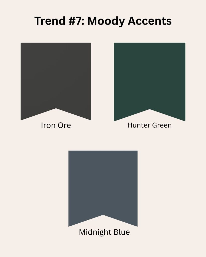
Moody walls make light wood cribs and creamy decor really pop — it’s a statement that still feels cozy.
How to Choose the Right Color for Your Space
With so many dreamy shades out there, choosing the right nursery paint color can feel overwhelming — but it doesn’t have to be. Here’s how to make it simple and fun:
01. Look at Your Natural Light
Rooms with lots of sunlight can handle deeper tones, while darker rooms often look best with lighter, softer colors.
02. Consider Your Nursery Style
Are you going for boho, vintage, modern farmhouse, or minimalist? Your style can guide your palette — earthy tones for boho, whites and blues for coastal, or blush and cream for vintage charm.
03. Test, Test, Test
Always test colors on the wall (not just the sample card!). Look at them in both daylight and evening light. Many brands even offer peel-and-stick samples — no mess, no regrets.
04. Think Long-Term
Choose a color that can grow with your baby. Neutrals and muted tones transition beautifully as the nursery becomes a toddler room and beyond.
05. Trust Your Gut
You’ll spend a lot of time in this space — late nights, early mornings, quiet moments. Pick the color that makes you feel calm and happy.
Closing Thoughts
The best nursery paint colors are the ones that make you smile every time you walk in. Trends are just a starting point — a way to inspire you to create a space that feels peaceful, joyful, and full of love.
Whether you choose a warm terracotta that reminds you of sunsets or a gentle sage green that feels like a morning walk in the garden, your nursery is a reflection of your heart — and that’s always on-trend.
So grab those paint swatches, pour a cup of tea, and start dreaming up your perfect color palette. Your baby’s cozy little haven is just a brushstroke away.
Save to Pinterest